My style changes in linocut
To start with: I already developed my creative side as a child, much later even studied design and discovered my love for illustration during my studies. So in 2018, when I started with lino printing, I already brought a lot of motivation and creative background with me.
Still, at first I didn’t really know where I wanted to go stylistically in lino printing. And I’m honest – if I hadn’t found a style so “early” that I felt comfortable with, that was also suitable for lino printing and that I could reinvent again and again – maybe I would have lost interest.
But see for yourself how I approached piece by piece my current colorful works. I was inspired mainly by works of great tattoo artists like Imme Böhme, Susanne König (Suflanda) or Amanda Toy.
The comparison
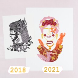
In the summer of 2018 I started with lino printing. This black and white image of a Viking woman was basically my first girl and the beginning of a long series! I named her Lagertha, because I was so impressed by the same-named protagonist in the series “Vikings”.
Funny that I depicted my first motif right away “without eyes” or with closed eyes – because I was afraid that a too “rigid” expression could look lifeless. I eventually made this original thought a “trademark”, but rather out of necessity. Nevertheless, I would not want to change it any more!
Classical Linocut
These works from 2018 look somehow “typical” for linoleum, and although I liked that, I did not feel it 100% – totally okay, I was just starting out! More “one-dimensional” works in black color only followed. But it wasn’t really working out for me.
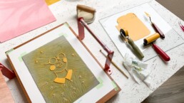
Using Color
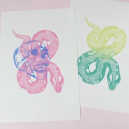
The snake and skull print was my first experiment of layering colors. I had two blocks and two designs that belonged to each other. Well, who recognizes the theme? It’s a bit abstract I know, haha – it’s “The Dark Mark” from Harry Potter! And I was one step closer to multi color printing as I do today.
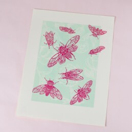
Then I created the picture with the cicadas and the peonies – I understood how important colors are to me and how much you can change the expression of a picture based on the colors.
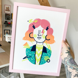
The hype was real
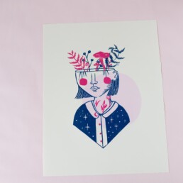
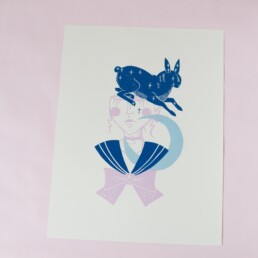
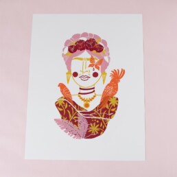
In October 2018 I designed the first girl that was formative for my work today! THIS was absolutely what I wanted to do in linocut! I was totally hyped by the result and drew the next design right away. And the next and the next. In the process, I put more and more symbolism into the individual elements. Well, and the rest is history. I’m so excited to see if my work in 3 years will still look like it does today or if my style will change again.
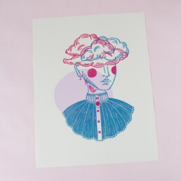
Serial work
I love it, it’s incredibly easy for me to design new theme girls because this “framework” is infinitely expandable. This has given me a lot of “security” and support to be creative. Because the structure is always the same, I can concentrate on the “creative” part, on the symbolism, the colors.
Summary
Most important: Give yourself time! Finding your own style is not something you can force. Mostly it’s a development that takes its time and sometimes it happens faster, sometimes it takes longer. Also it’s always in flux, because the more secure we feel in drawing, the more willing we are to make excursions in other directions and take inspiration from here and there.
If you need more input on lino printing and finding your style, then this article will be exciting for you. Here I show which simple styles I think are good for lino printing beginners!
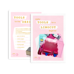
Linocut Tool Guide
Still unsure which tools and products you need for your lino printing starter kit? Just download my guide with product recommendations for linocut beginners – on 6 pages I list all the materials and tools I need to make my colorful prints – and you can do it too!
4 simple illustration styles for linocut
Are you good at drawing? Do you think you have to be good at it to make “beautiful” art? Or do you just lack inspiration? These and similar questions concern many creatives, and they can inhibit us from creating anything at all. But art lives from the fact that we do things differently and bring in our own view of the world.
For a quick win, I’m going to show you 4 “simple” illustration styles that are best suited for multicolor lino printing – and simple is not meant in a judgmental way, but more on that later.
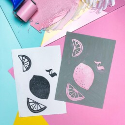
#1 Abstract shapes
Abstract shapes have something very timeless, classic. Here, the colors and their harmony with each other play an important role. But also the proportions and the arrangement of the forms make the charm of this style. A motif can express lightness or heaviness, it can appear balanced by a symmetrical arrangement of elements or dynamic if you work with an asymmetry. This is a very beginner-friendly style for anyone who wants to learn lino printing.
The results are sure to succeed, as carving the shapes is easy even for the inexperienced. In addition, the shapes can be arranged in any way each time, which invites experimentation.
#2 Floral
Floral shapes are always something for the eye – and not at all difficult to draw! Forget about realistic illustrations – you can’t do much wrong here. Because the organic forms of nature encourage abstraction. The overprinting of different leaves and branches in various colors can thus become a bouquet of flowers or a jungle. Good to combine with some abstract shapes.
#3 Minimalistic landscapes
A style that has been particularly trendy for a few years now – and with good reason! You can hardly get enough of landscapes. Our choice of color decides whether the landscape is rather in a hot place or whether a cool fjord is part of the picture. If you love traveling, you can perfectly express this passion in your pictures.
In principle, the pictures are always structured quite similarly. We can depict hills or dunes by building up the lower half of the picture in a wave-like manner. A sun or a moon on the horizon, done! This style leaves quite a lot of room for individuality.
#4 Typography
I have to admit – typography is a design discipline all of its own, and one that I have a lot of respect for! The challenge here is not so much in carving and printing, but rather in having a feeling for a font and finding the “right words”. Still, it counts as one of the “simple” illustration styles for me (please forgive me, dear typographers) because it’s easier to craft than some other styles and you can set the entrance lower ut still create something beautiful!
Words are powerful – they can strengthen and motivate us, bring us closer to each other. Therefore, I can only encourage everyone to dare to try this art.
Summary
These are just 4 examples of how you can create wonderful art with reduced shapes and all of them are perfectly suitable for lino printing. They also leave room for your drawing development and you can always modify them, reinvent them or change them by using a different color set. Find more inspiration on my Pinterest board.
I personally love serial work because it gives me a “safe” framework within which I can experiment. If you know my work, you can tell that the basic structure of my girls never really changes. But the theme does! So it’s incredibly easy for me to come up with a new design because I start with a “safe framework” each time – and not from 0.
My advice to those who want to start with lino printing: Pick a (simple) style that you like right away and stick with it for now. Please don’t copy, that should be clear! But with each work that goes in the same direction as the previous one, you will gain confidence and all by itself more and more own thoughts flow in. Find out more about my journey in this article.
Linocut Tool Guide
Still unsure which tools and products you need for your lino printing starter kit? Just download my guide with product recommendations for linocut beginners – on 6 pages I list all the materials and tools I need to make my colorful prints – and you can do it too!
Linocut printing tools for beginners
The question of all questions: What tools do you need as a lino printing beginner? Of course, you don’t want to spend a lot of money at the beginning and certainly not on the “wrong” materials. Still, I can only advise not to go for the cheapest materials, because they have one major drawback: without practice and skill, they can frustrate you very quickly.
I have read many horror stories about lino printing in school. They all have blunt tools and hard linoleum plates in common – and sometimes bad injuries! So I think a mix of beginner and professional products is a better choice.
In this article, I’ll tell you which products you can save money on and which you’d rather spend a little more on.
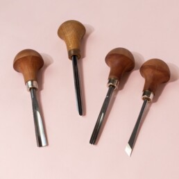
Carving tools
A tool that either makes your work much easier or much more difficult. Here I would not save money and advise to rather reach for the more expensive knives that professionals also use. Because in the beginning 3 different sizes are quite enough! The cheap set blades, however, blunt very quickly and often can not be sharpened. The result: the blade slips easily, which significantly increases the risk of injury.
I find a v-shaped blade very useful for line work. My choice would be a medium size, because with little pressure you can carve fine lines and with more pressure you can carve deeper grooves! A very wide and flat blade is best for carving out larger areas, such as backgrounds. Third, you can do little wrong with a wide u-shaped blade.
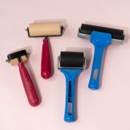
Ink rollers
With ink rollers, you can go for cheaper models. I prefer soft rubber rollers, because they distribute the ink more evenly over the block. For starters, two rollers are enough, for example, one narrow and one medium width. Of course, this depends a lot on the size and detail of your design. I work exclusively in A4, so I get along very well with these sizes.
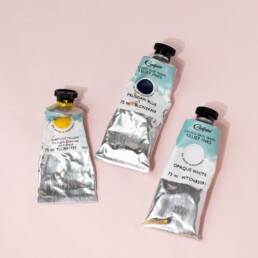
Ink
Oil-based or water-based? My advice: Always oil-based – but they should be washable! Because indeed, there are oil-based inks for which you need special cleaners. But also there are oil-based inks that you can clean very easily with water and dishwashing detergent – it works like a dream! “Caligo Safe Wash Relief Inks” from the British company Cranfield Colours belong in this category and they are the hot tip for anyone who wants to work with linoleum.
The disadvantage of water-based inks is mainly the processing time, because the water component dries very quickly. So if you want to make a lot of prints of a design, you quickly get frustrated because the mixed ink dries on the roller and the lino block which negatively affects the print result. With oil-based inks, on the other hand, you can work for hours – of course, the print doesn’t dry immediately either, so you have to keep that in mind!
The print result also differs: that of a water-based ink feels a bit rough and looks matt, that of an oil-based ink silky soft and slightly glossy.

Paper
In my experience, you don’t need expensive, fancy paper for a high-quality look and feel. I buy my paper at a print shop and have it cut to my preferred standard size of 30×40 cm. It is 160 g heavy paper, which is also used for printing flyers, magazines and other print products. The very specific one I use is called „Design Offset White“.
Note: The heavier the paper, the more difficult it is to achieve a consistent print result, especially without a press.
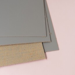
Lino blocks
Traditional grey lino is my favorite, often found under the name “Battleship Grey”. Brown linoleum crumbles faster, and softcut or vinyl panels cut differently. Personally, these alternatives simply lack the feel of “real” linoleum – the smell and feel matter to me.
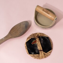
Baren
If you do not want to invest in a press at the beginning, you can work perfectly with a wooden spoon and a Japanese baren. You need a little more time and patience, but you can create just as beautiful prints as with a press!
Summary
Two things that are not worth saving on: ink and carving tools. They make the massive difference between fun and frustration later on. On the other hand, you can compare prices for paper, ink rollers and printing tools. When it comes to lino blocks, there’s not that much difference price-wise – the combination of sharp carving tools and traditional grey lino blocks is ideal I think.
Linocut Tool Guide
Still unsure which tools and products you need for your lino printing starter kit? Just download my guide with product recommendations for linocut beginners – on 6 pages I list all the materials and tools I need to make my colorful prints – and you can do it too!