To start with: I already developed my creative side as a child, much later even studied design and discovered my love for illustration during my studies. So in 2018, when I started with lino printing, I already brought a lot of motivation and creative background with me.
Still, at first I didn’t really know where I wanted to go stylistically in lino printing. And I’m honest – if I hadn’t found a style so “early” that I felt comfortable with, that was also suitable for lino printing and that I could reinvent again and again – maybe I would have lost interest.
But see for yourself how I approached piece by piece my current colorful works. I was inspired mainly by works of great tattoo artists like Imme Böhme, Susanne König (Suflanda) or Amanda Toy.
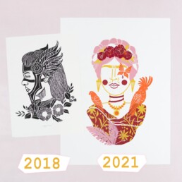
The comparison
In the summer of 2018 I started with lino printing. This black and white image of a Viking woman was basically my first girl and the beginning of a long series! I named her Lagertha, because I was so impressed by the same-named protagonist in the series “Vikings”.
Funny that I depicted my first motif right away “without eyes” or with closed eyes – because I was afraid that a too “rigid” expression could look lifeless. I eventually made this original thought a “trademark”, but rather out of necessity. Nevertheless, I would not want to change it any more!
Classical Linocut
These works from 2018 look somehow “typical” for linoleum, and although I liked that, I did not feel it 100% – totally okay, I was just starting out! More “one-dimensional” works in black color only followed. But it wasn’t really working out for me.
Using Color
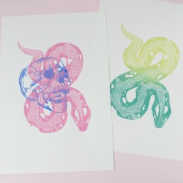
The snake and skull print was my first experiment of layering colors. I had two blocks and two designs that belonged to each other. Well, who recognizes the theme? It’s a bit abstract I know, haha – it’s “The Dark Mark” from Harry Potter! And I was one step closer to multi color printing as I do today.
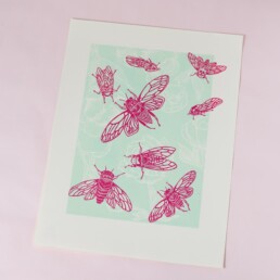
Then I created the picture with the cicadas and the peonies – I understood how important colors are to me and how much you can change the expression of a picture based on the colors.
The hype was real
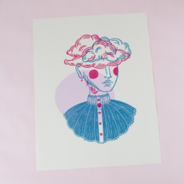
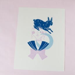
In October 2018 I designed the first girl that was formative for my work today! THIS was absolutely what I wanted to do in linocut! I was totally hyped by the result and drew the next design right away. And the next and the next. In the process, I put more and more symbolism into the individual elements. Well, and the rest is history. I’m so excited to see if my work in 3 years will still look like it does today or if my style will change again.
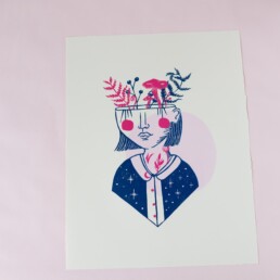
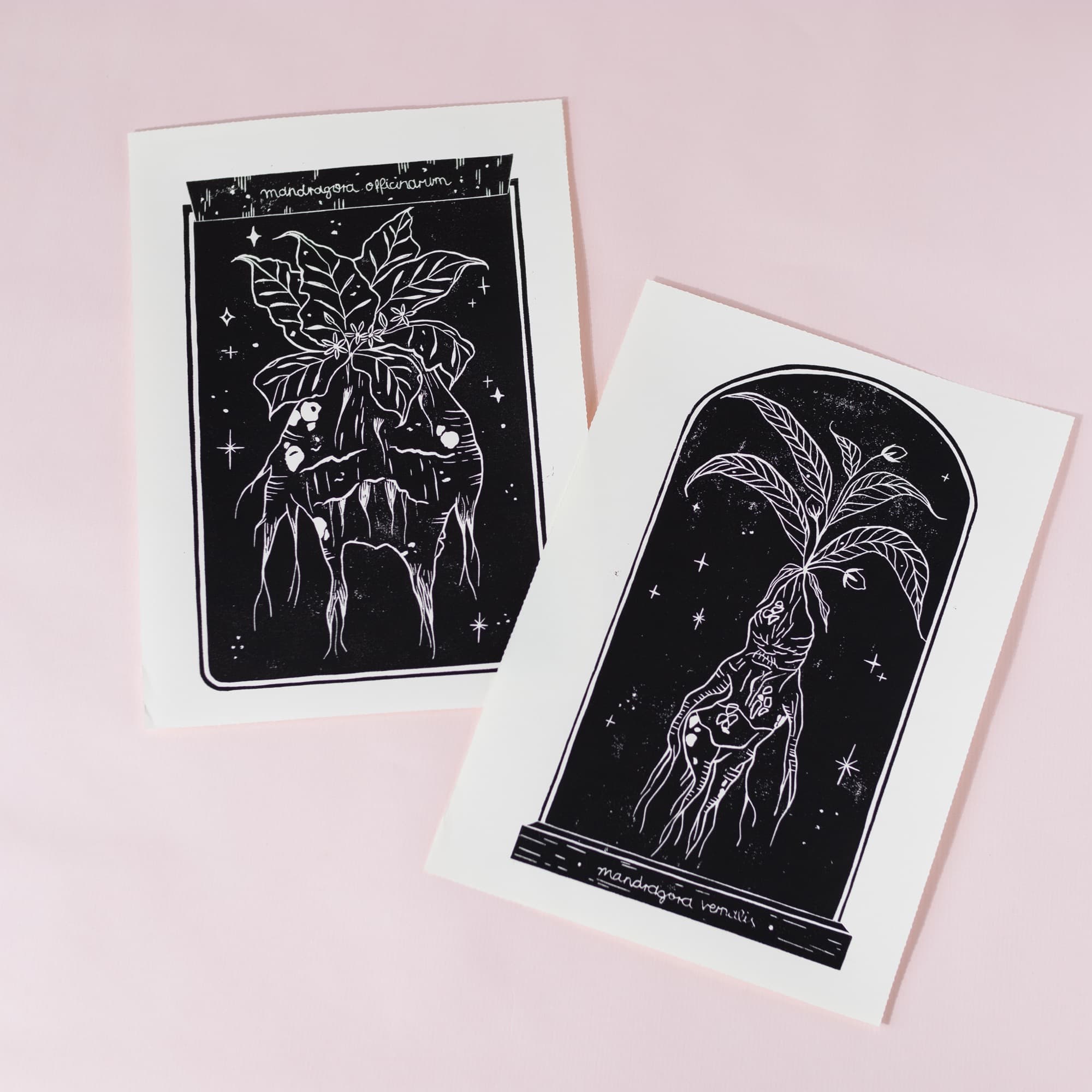
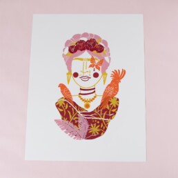
Serial work
I love it, it’s incredibly easy for me to design new theme girls because this “framework” is infinitely expandable. This has given me a lot of “security” and support to be creative. Because the structure is always the same, I can concentrate on the “creative” part, on the symbolism, the colors.
Summary
Most important: Give yourself time! Finding your own style is not something you can force. Mostly it’s a development that takes its time and sometimes it happens faster, sometimes it takes longer. Also it’s always in flux, because the more secure we feel in drawing, the more willing we are to make excursions in other directions and take inspiration from here and there.
If you need more input on lino printing and finding your style, then this article will be exciting for you. Here I show which simple styles I think are good for lino printing beginners!
Linocut Tool Guide
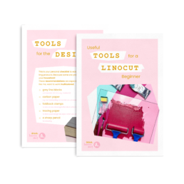
Still unsure which tools and products you need for your lino printing starter kit? Just download my guide with product recommendations for linocut beginners – on 6 pages I list all the materials and tools I need to make my colorful prints – and you can do it too!